First look: GNOME 3.0
by Thorsten Leemhuis
After a lot of preparatory work, the GNOME project has released the first version of the third generation of GNOME. With its modern design approach, subtle graphics effects and fresh UI concept, the new version presents itself much more modern and sleek than its predecessor – but it also needs to be handled differently.
After the release of GNOME 2.0 in the summer of 2002, the second generation of GNOME made enormous development progress – but the GNOME project never made any significant changes to the basic desktop elements and the way they operate. GNOME 3.0 is set to provide a fresher, more modern look for the desktop interface; after evaluating research results in the field of computer interaction, and experiences with other User Interfaces (UIs), the GNOME project has also thrown out various established concepts and implemented new approaches. Together with the subtle use of graphics effects, these measures are designed to simplify users' desktop experience.

Having been in development for several years, the third generation of GNOME consequently differs from GNOME 2 in many respects; even seasoned GNOME users will, therefore, find many aspects that are very unfamiliar. This attracted considerable criticism even before the version was completed – however, some aspects of GNOME 3.0 that seemed awkward at first have turned out to be well-crafted on closer inspection.
Switchboard
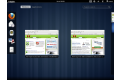
The largest and most obvious new feature is the GNOME Shell. It operates as a central switchboard and, in normal operation, only displays a black panel at the top of the screen. The shell shows its full capabilities when users move the mouse pointer into the left top corner of the screen or clicks on the "Activities" label in this area. As an alternative, the shell can also be opened by pressing the Super key (usually the left Windows key) or Alt+F1.
This makes the "Dash" quick-launch area appear on the left side of the screen, while a workspace selector hints at its existence on the right; a system status area appears at the bottom of the screen. At the centre of the screen, the GNOME Shell displays all windows of the active workspace next to and below each other, similar to Exposé in Mac OS X and the Scale plug-in in Compiz.
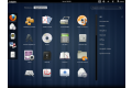
In addition to this "Window picker", as the designers call it, there is also an "Application picker" that is accessible by clicking on "Applications" next to the "Windows" button in the top left area of the screen. A third view, potentially called "Journal", may also be added in GNOME 3.2. Together with the Zeitgeist component, which didn't make it into GNOME 3.0, it is designed to offer a novel approach to data browsing and finding that might prove quite practical in everyday use.
In these views, a search field appears in the top right area of the screen. When the shell is opened, this search field is automatically given the input focus and will locate applications, files, folders and system properties that match the entered search term. Frequently used applications can be marked as favourites via the context menu, which makes them appear in the Dash on the left. In addition to the favourites, the Dash also displays the icons of all running applications; a window list such as the one typically offered at the bottom of the screen in GNOME 2, KDE and Windows is not available in GNOME 3.
Windows and areas
Window bars don't offer any minimise/maximise window controls; however, this functionality is still available by right-clicking on a window's top bar. GNOME and GTK+ development veteran Owen Taylor explained the reasons for removing the controls in a comprehensive email. In this email, the developer indicates that workspaces may make it unnecessary to minimise windows.
GNOME 3 generally invites people to use workspaces, a concept that is already familiar from GNOME 2 and other desktop environments but works slightly differently in GNOME 3. For example, it is impossible to configure the number of workspaces: The GNOME Shell creates and removes them dynamically so that there is always a free workspace right at the bottom. Icons from the Dash or the application picker can be dropped onto one of the spaces in the workspace selector to start them there.
However, the workspace concept only become a truly convincing feature once one has memorised the keyboard combination for switching between workspaces that GNOME 2 already offered in a similar way: Ctrl+Alt+Cursor down switches to the workspace below the current one, Ctrl+Alt+Cursor up to the one above it; pressing Shift at the same time also grabs the the currently active window and moves it to the workspace being navigated to.
Alt+Tab remains available for finding a window and for switching between running applications. The resulting selector dialogue is much larger than in GNOME 2 and can be operated via mouse and keyboard while the Alt key is being held down. Only one icon per application is available. If a program consists of multiple windows, this is indicated by a small arrow pointing downwards underneath the icon; hovering for a moment on such an icon will drop down a window selection sub-dialogue.
Next: Bars, fallback options and preferences
![Kernel Log: Coming in 3.10 (Part 3) [--] Infrastructure](/imgs/43/1/0/4/2/6/7/2/comingin310_4_kicker-4977194bfb0de0d7.png)

![Kernel Log: Coming in 3.10 (Part 3) [--] Infrastructure](/imgs/43/1/0/4/2/3/2/3/comingin310_3_kicker-151cd7b9e9660f05.png)